January 11, 2020
Several months have passed since our wedding, but I finally have the chance to go back and talk about wedding planning to help those who are in the middle of preparations at the moment. I wanted to talk about wedding invitations, because even if it seems to be something futile, it’s important to understand that an invitation sets the tone for an event. The invite your guests will receive in the mail will give them an overview of the evening ahead, and this invitation should reflect your couple, your style. Easy? Not so easy actually… I asked Maria De Rosa from Papier Fashionista, the designer who took care of our invitations, to tell you about trends and the inspiration behind our invitations.
Maria, how would you describe us as a couple and how does it reflect in the invitations?
Caroline, you and Marco kindness made it really easy for me to create your wedding invitations. You trusted Papier Fashionista and I really got to see who you truly are as individuals and as a couple. You are both two of the sweetest souls I’ve got to meet and work with!
The invitations were very simple, clean cut, with a edge of uniqueness. And the invite that we have designed for you sums up the peaceful vibe you both give out .
What are this year’s trends, is it anything we chose in our own invitations?
Trends are very touchy. Because what a trend might mean to one is not the same for another … However besides laser cuts, which have been around for a while now, the antique letter press and rustic green feel you chose as the design for your wedding invitations is super hot for the 2020 season .
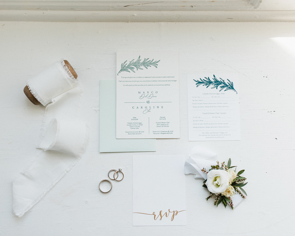
What kind of paper did we choose?
Texture is so important when making an invitation design choice. The cotton base letter press paper you chose gave out that romantic feel of Tuscany (where we got married).
How important is the paper when choosing an invitation?
We have a variety of different paper choices which we use to combine the right printing techniques and possibilities that include different types of texture and materials. When we designed Caroline and Marco’s invitations, we used a rich thick letter press paper that left a clean read. Every letter and design was visible. As we guide you through, it is extremely important when a selection is made you understand and see the different types of print options that react according to the texture and weight of the paper. For example, metallic paper absorbs more ink than a regular cardstock matte paper. So even though the design or image is the best of quality, it may react and or look different on different paper types. Note that we work really closely with our printing department to achieve the best flawless look on any type of paper .
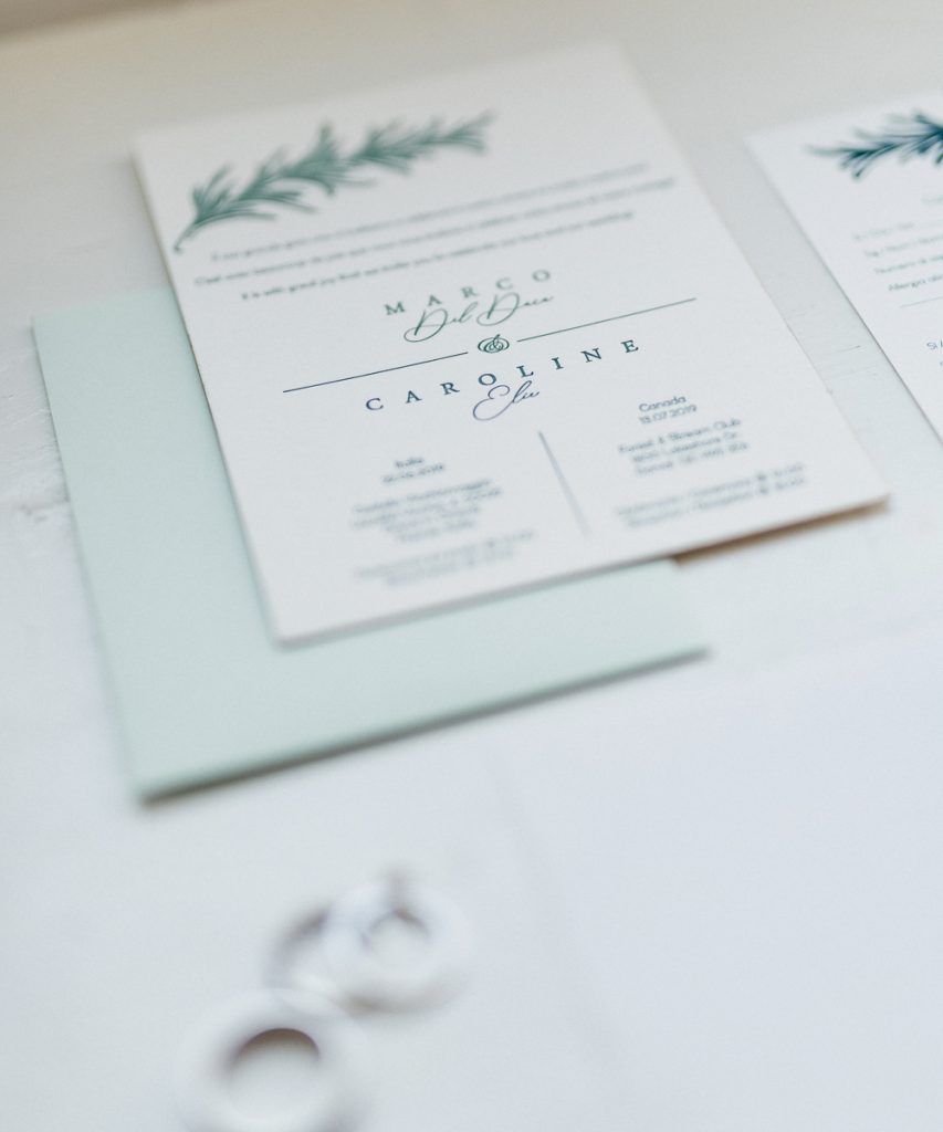
We managed to put three languages on one page! How did we achieve this?
If you are worried about how to add different languages on the invites, please use Caroline and Marco’s invitations as an inspiration! We have many different design options for different budgets. As you can see on Caroline and Marco’s invitations, the three languages worked out perfectly and the writing was proportioned properly, creating a beautiful blend for these two beautiful souls .
Our tip: We kept the message and the details simple so that everything was there, and everyone could feel like they understood it properly (our friends and family all speak French, English or Italian. What do you think of the final result?
Crédit photos: Sonia Bourbon
Photography credit: Sonia Bourbon